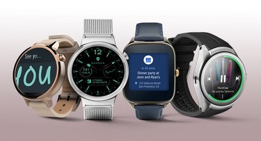
Time for an update: Android Wear 2.0 is officially out! The upgrades, many of which were unveiled at Google's I/O Conference last May, are significant improvements over the first version. Google made big changes to the watch face, messaging, notifications, and apps.
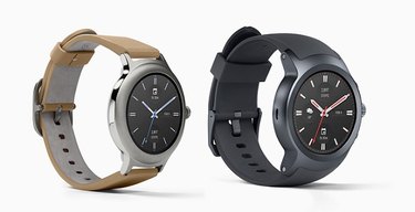
The first two watches to run Android Wear 2.0 are the LG Watch Sport and the LG Watch Style, both watches designed in partnership with Google to show off the best aspects of the new operating system. They go on sale today, Feb 10, so if you're reading this, they're already available. More models from other manufacturers will follow in the coming weeks.
Video of the Day
Video of the Day
When your Android Watch will get the update
If you already own an Android watch, look for these new features to roll out to you in an update sometime in the next few weeks or months. Be aware, though, that not all existing watches will get 2.0. Here's the complete list due for updates:
- ASUS ZenWatch 2
- ASUS ZenWatch 3
- Casio Smart Outdoor Watch
- Casio PRO TREK Smart
- Fossil Q Wander
- Fossil Q Marshal
- Fossil Q Founder
- Huawei Watch
- Huawei Watch Ladies
- LG Watch Urbane 2nd Edition LTE
- LG Watch Urbane
- LG G Watch R
- Michael Kors Access Bradshaw Smartwatch
- Michael Kors Access Dylan Smartwatch
- Moto 360 2nd Generation
- Moto 360 Sport
- New Balance RunIQ
- Nixon Mission
- Polar M600
- Tag Heuer Connected
Untethered at last!
The biggest improvement may be that some Android Wear 2.0 watches now work independently of phones, whether through cellular or WiFi. They can of course still connect to smartphones via Bluetooth. But armed with an LTE-equipped watch, you can leave the phone at home an still do pretty much everything the Android Wear supports.
A better watch face
If you bore easily, Android Wear definitely has your number. The OS already boasts an astonishing 4,000 watch faces on the Google Play store. But now Android Wear has simplified the process of switching between watch faces. If you don't like the watch face you currently have just swipe up while in the watch drawer and it's replaced.
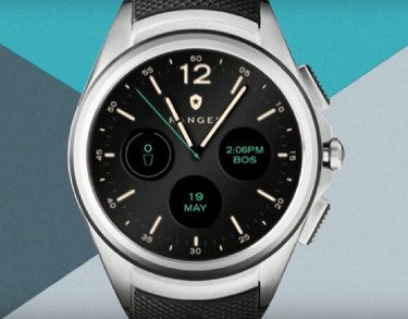
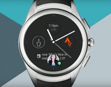
Perhaps the biggest improvement, however, is the addition of small visual elements to the watch face that provide useful, "glanceable information." You can add up to four of these elements--called "complications" among watch fans--on your watch face, whether a date element, events calendar, calorie counter, photo album, and so on. A quick tap on an element brings it up to full screen. Setting up elements is mercifully simple. Here you can see what elements look like on a watch face. They give it a pilot watch sort of look.
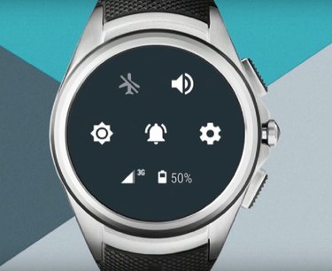
Also improved is the settings menu, which you access by dragging down like a window shade from the top of the watch. It's more compact than in version 1.0 giving you all the settings on one screen. Among these settings is brightness control, which was an ongoing complaint from 1.0 users because it was a bear to reach. With 2.0, the problem is fixed and then some. Not only is the brightness setting accessible by a quick swipe and tap, but you also get a preview of what the watch face will look like as you adjust the brightness. Below is a view of the quick settings menu.
A small, helpful addition worth mentioning is that when scrolling, a small thumbnail hovers over your watch face, indicating exactly where you are on the screen.
Finally, it's easier than ever to get back to your watch face. Say you've drilled down into an app or settings. Two taps of the hardware button on the side of the phone will bring you back every time.
Apps get a makeover
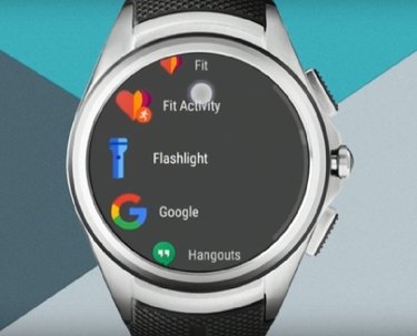
Apps are easier to access. Pressing the hardware button brings you to them. The display has changed to a kind of carousel which rotates around the left side of the screen. As the apps swing around they increase in size to make them easier to view and select. Also convenient is that your most-used apps will start to appear at the top of the list.
Smarter messaging and notifications
Both messaging and notifications are more intuitive in Android Wear 2.0. When you get a notification, so long as your watch is in 'always-on' mode, the message will fill your screen. After a few seconds it drops away.
When you wake your watch, another reminder reappears for a few seconds, this time a small pop-up. If you choose to answer, swipe up and the card with the message will appear. You're able to reply directly in the message.
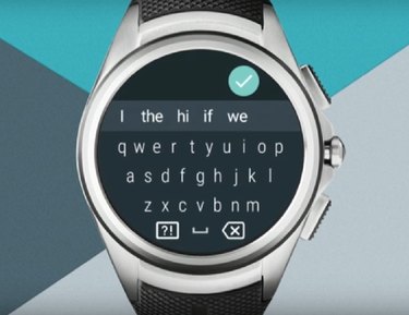
As with version 1.0, you can answer messages with voice, emoji or canned replies, (which are reportedly going to get smarter). New is the addition of a keyboard with predictive typing.
iPhone gets some love as well
Lastly, while iPhone compatibility debuted at the end of 2016, it was limited. Android 2.0 expands the capabilities of Android Wear watches with iPhones.
