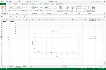
When you first create a chart in Excel 2013, the result might appear confusing -- with some chart types, most notably line charts, Excel displays the X axis as "1, 2, 3..." regardless of the data you actually want as your X axis. For charts where you want to specify an X-axis range of numbers, you first need to switch to a scatter chart and then select the range.
Step 1
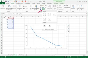
Select your chart and pick a scatter chart style from the Insert tab to change the chart type.
Video of the Day
Step 2
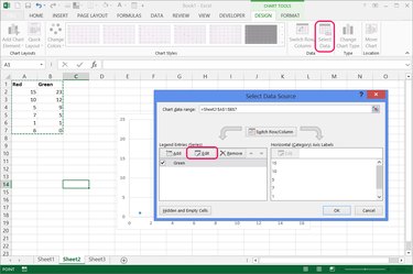
Open the "Design" tab and press "Select Data." If you have two adjacent columns of data -- X-axis data on the left, Y-axis on the right -- select them and press "OK" to remake the chart using your X-axis range, and skip the following step.
Alternatively, if the X-axis data you want to use isn't situated directly to the left of the Y-axis data, press "Edit" in the Legend Entries section.
Step 3
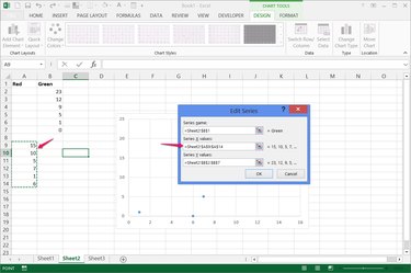
Select the X and Y ranges separately using the Series X Values and Series Y Values fields. Press "OK" on both dialog boxes to remake the chart.
Step 4
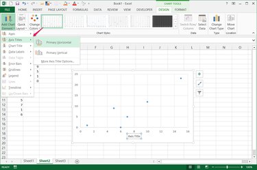
Press "Add Chart Element" on the Design tab to add "Axis Titles" for each axis, clarifying their relationship.
Step 5
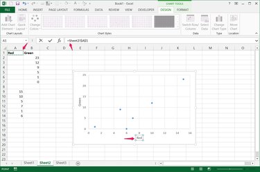
Type in an axis title's name by hand, or select it, type "=" in the Formula Bar and click a cell that bears the axis's name.
Video of the Day
- Microsoft Office: Update the Data in an Existing Chart
- GCF LearnFree.org: Excel 2013 -- Chart Layout and Style
- Microsoft Office: Change Axis Labels in a Chart
- Microsoft Office: Create a Combo Chart With a Secondary Axis
- Microsoft Office: Select Data for a Chart
- Microsoft Office: Present Your Data in a Scatter Chart or a Line Chart