When you want to visualize the frequency of data falling within specific parameters, use a histogram chart. For example, a histogram can show a teacher how many students received each score on a test.
To create a histogram, you need two columns of data. The first column contains the range, or bin numbers, such as different test scores. The second column contains the frequency, or the number of students who received each score. Provided you have these two sets of numbers, you can create a histogram using Microsoft Word 2013.
Video of the Day
Video of the Day
Step 1
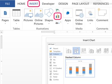
Click the Insert tab and then click the Add a Chart icon from the ribbon's Illustrations group. Select Columns and then click the Stacked Column icon. Click OK.
Step 2
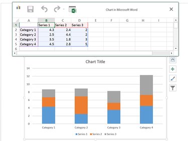
Click the table that opens. Note that the data in the table is represented in the chart below it. As you change the table, the chart changes automatically.
Step 3
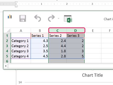
Drag the cursor across the column C and D Headers and press Delete. You don't need these columns for a histogram.
Step 4
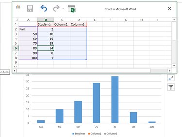
Replace the data in column A with your bin numbers and the data in column B with your frequencies. Replace Series 1 in cell B1 with a name for your frequency data if desired. In this example, the test scores are the bin data and the number of students receiving those scores gives the frequency data.
If you add new rows to the table, additional bars appear in the chart. Close the table by clicking the X when the data is complete.
Step 5
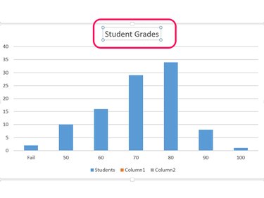
Click the Chart Title. Highlight the words and type a title for your histogram.
Step 6
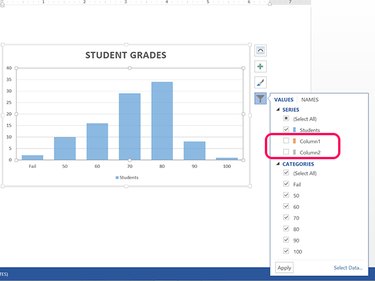
Click the Chart Filters icon. Clear the Column 1 and Column 2 check boxes.
Step 7
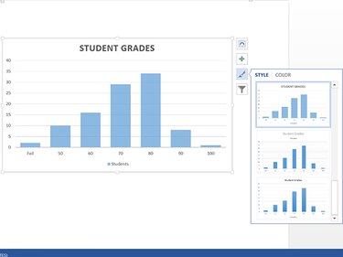
Change the chart style if desired by clicking the Chart Styles icon. Click any style to automatically change the appearance of your histogram.