The charting tools in Microsoft Excel provide an excellent way to plot the known relationships of ordered or unordered pairs on a calibration curve. Add a trend line to the chart to project the characteristics of entities with only one known value.
Step 1: Open Data Source

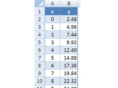
Open the Excel workbook containing the "known" values to be plotted on a calibration curve. Arrange the data in pairs entered one pair to a row with the values in adjacent columns. The data columns should have appropriate headings. Sort by one of the columns if the data require a specific order.
Video of the Day
Step 2: Create Calibration Curve

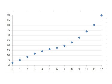
Highlight all of the data to be used for the calibration curve. Click into the heading at the top of the right-hand column of data (labeled as "x" in the example). Hold down the mouse button and drag the mouse pointer down to the last cell in the left-hand column (labeled as "y" in the example). Release the mouse button. Click the Insert tab and click on the Scatter Chart icon to display its gallery of scatter chart variations. Click the Markers Only option to generate a scatter chart with a marker representing each data pair.
Step 3: Add Trendline

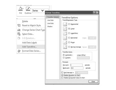
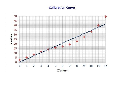
To add a trend line to the scatter chart, right-click the data curve representing the "y" values and select Add Trendline from the pop-up menu. In the Format Trendline dialog box, select Linear and click the Close button.
Step 4: Complete the Chart

To alter the look or to choose a different format for the chart, use the options displayed on the Chart Tools ribbon's Design tab that displays when a chart is selected and active.
Video of the Day