Word's Chart tool has several types of chart design, including pie charts. Default charts come with a connected worksheet, ready for you to insert or copy the data that creates the layout of the chart. Once you've added data, use editing tools to change the chart's format, style and color to get it looking just right.
Step 1: Insert the Pie Chart
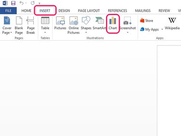
Select the Insert tab and then the Chart button.
Video of the Day
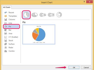
Select Pie from the menu bar. Choose a design and select OK to insert the template in the document.
Step 2: Add Data to the Pie Chart
When you choose a pie chart, an Excel datasheet with sample data opens under the chart. You need to replace this data with your own.
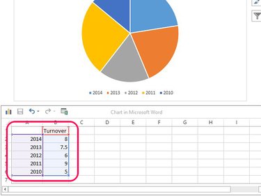
Enter or copy your own data in the sheet. Replace the column title with the name of your chart and the row titles with your data labels. When you've added all the data, close the sheet by selecting the X on the corner.
Step 3: Format the Chart
To change the chart's layout, format or design, select the chart to open four quick format tools at its side.
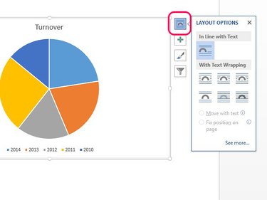
Select Layout Options to change the way the chart sits in surrounding text or to fix its position on the page.
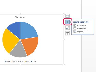
Select Chart Elements to show or hide the chart's title, data labels or legend.
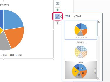
Select the Style and Color paintbrush to change the chart's style or color scheme. Select Style to apply a new design to the chart and Color to change its colors.
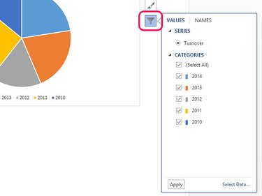
Select Chart Filters to hide any of the categories in the pie chart by unchecking their boxes and selecting Apply.
Video of the Day