To make the most of a text-based logo, a business owner must understand how font style and capitalization relates to the look and feel of the corporate business. Whereas all-lowercase text can signify a casual, reposed environment, all-uppercase text feels traditional and proper. When it comes to choosing between the two, think of your corporate culture and how the text embodies the principles of your business.
Lowercase Text
Video of the Day
All lowercase logos have an inherently reposed feel due in part to companies such as McDonalds, which used the hip, causal all-lowercase look for its tagline, "i'm lovin' it". Other companies that have followed suit include Vitamin Water, AT&T and BP, which each feature lowercase type on their logos. In 2009, Patti Williams, a professor of marketing at the University of Pennsylvania's Wharton School, said "logos have become less official-looking and more conversational," a concept that has popularized the use of all lowercase logo font and taglines.
Video of the Day
Uppercase Text
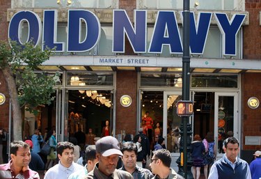
All-uppercase text feels official and strong. It might serve as a good choice for businesses that want to evoke authority through their logos in the marketplace. Good examples of all-uppercase text logos include apparel retailer Old Navy, with its robust san-serif text, Southwest Airlines in a bold, all-black capitalized font and mega-retailer Target with its red, iconic text. All uppercase doesn't have to evoke a completely stiff or stuffy expression. You can soften its outwardly strong appearance by using soft colors or adding graphics that diffuse and complement the text.
Traditional Capitalization
A quintessentially timeless expression comes from traditionally capped text on a logo. Traditional capitalization is capitalizing the first letter in every word. Corporations that embody the traditional feel through the outward expression of their logos include Coca-Cola, Microsoft, Hanes, Valvoline, Heineken and Nestle. Many businesses choose traditional capitalization to evoke a timeless feel without the constant need to reinvent a bolder logo choice.
On Corporate Culture
Corporate culture plays a large role in the type of font you choose for your logo design. A reposed, friendlier business might opt for an all-lowercase text choice because it resembles its vision of a credible, human-centric internal corporate culture. In 2006, Cisco unveiled its all-lowercase logo explaining "the logo change makes corporate change both perceivable and more credible." All caps, on the other hand, signify a business grounded in traditionalism. IBM is a good example of an all-caps logo that has stood the test of time since it was unveiled in 1947.
Changing Your Text-Based Logo
For businesses contemplating the change from all caps to lowercase text, you stand in good company as many businesses have taken to a softer logo redesign. Xerox changed its all-caps logo to a softer, all-lowercase font in January 2008, and in that same year, Walmart went from all-caps to traditional capitalization and a softer hue to increase the friendliness of the logo's outward expression. If your business is considering a similar move, talk to a logo design specialist to get several prototypes underway, and choose the logo text that best suits your company's corporate culture.