
Concentric circles can help readers visualize complex processes and relationships. Concentric circle charts always read from the inside, working outward. However, when drawing one in Word, it's much easier to work with if you draw it from the outside and work inward to ensure that all circles are visible -- this is because each circle you add to a chart is placed on its own layer on top of the circles you drew before it.
Step 1
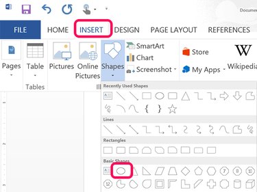
Click the Insert tab and click Shapes. From the drop-down menu click the Oval. Drag the cursor over the page while holding down the Shift key to draw a large circle. This will be the outside circle of the chart, so make it large enough that your other circles will fit inside.
Video of the Day
Step 2
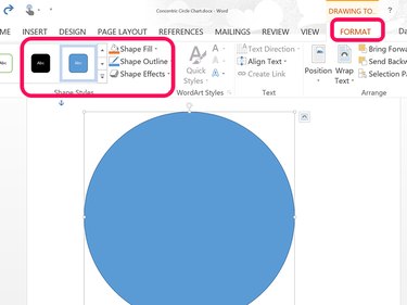
Click the Picture Tools Format tab while the circle is still selected. Choose a style from the Ribbon or use the Shape Fill and Shape Outline options to customize its appearance.
Step 3
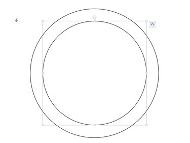
Draw a new circle inside the large circle. Alternatively, copy and paste the first circle by pressing Ctrl-C and Ctrl-V and then shrink the copy by dragging a corner. Always hold down the Shift key when drawing or resizing a circle to keep its aspect ratio. Add as many circles as you need for the chart, moving inward from the largest to the smallest. Each circle can be any color you want.
Step 4
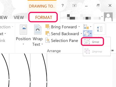
Group the circles so you can move or resize the chart as needed. To select the circles, click the outer circle first, and then each circle towards the middle. Once they are all selected, click the Picture Tools' Format menu, click the Group icon and select Group from the drop-down menu.
Step 5
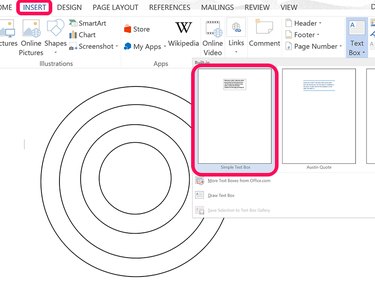
Add labels to the chart by using text boxes. Click the Insert tab, select the Text Box icon in the Ribbon and then select Simple Text Box. Drag the cursor on the document and type a label.
Step 6
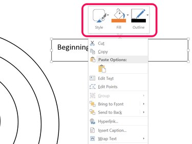
Right-click the text box and select a style, or use the Fill and Outline options. Change the font style and font size as needed.
Step 7
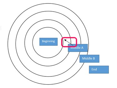
Place the labels outside of the circles if they are too large for the rings. Select a line or an arrow from the Shapes option under the Insert tab and drag it from the label to the ring it describes. To ensure that the arrows don't overlap the labels, use the Send Backward option under the Picture Tools' Format tab to move each arrow below the labels.
Step 8
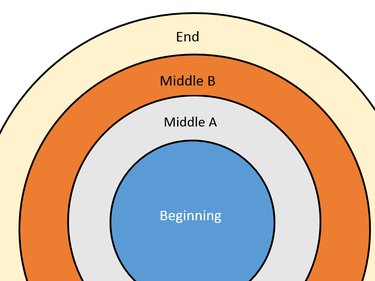
Position the labels inside each ring if they fit. Change the text box border and fill color to match the color used inside the ring. If the ring is a dark color, use a light font in the text box.
Step 9
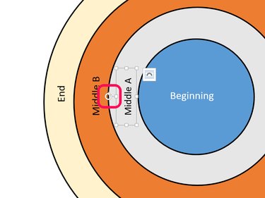
Rotate labels if you want to put them on the side of the chart. When you select the label, a curved arrow appears on the top. Drag this arrow to rotate the text box, and then drag the text box to where you want it to appear.
Video of the Day