In word processing, Web browsing and digital publishing, the term "text reflow" refers to when the text in a document automatically shifts to fit the page, the screen or the window. Without text reflow, documents and websites would only fill a small portion of the screen on high-resolution monitors, but would require scrolling on low-resolution monitors. Most digital formats that deal with text utilize reflow in some manner, with a few notable exceptions.
In Word Processing
Video of the Day
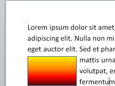
When you type a document in Microsoft Word or another word processor, the program fits the text into the specified margins. Add a word, change the font size or delete a line, and the text automatically reflows to remain within the margins of each page. Text can also reflow around images. In Word, text-wrapping settings such as Square and Tight flow text around the image's borders. However, if you set an image's text-wrapping to Behind Text, the text won't reflow and will fall behind the image instead.
Video of the Day

On the Web
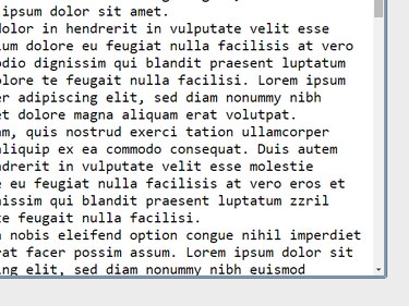
When you browse the Web, you rarely come across a site where you need to scroll horizontally to read text, thanks not only to well-designed pages, but also to your Web browser reflowing text to fit the window. When a Web page doesn't include its own formatting instructions, your browser inserts line breaks to prevent text from going off the right side of the screen. As a test, open a plain text file in your browser and resize the browser window. Try pressing Ctrl-Plus and Ctrl-Minus to change the page's zoom. As you adjust the browser, the text reflows, preventing the need for horizontal scrolling.

On Smartphones
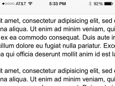
Text reflow is especially important when browsing the Web on smartphones, due both to their small size and the fact that different phone models have different screen resolutions. To make sure pages fit the screen, however big that screen is, Web designers use CSS — Cascading Style Sheets — which specify how page elements are positioned and styled. Rather than set specific dimensions in the style, such as "a 2-inch block of text," designers use styles that work on any screen size, such as "a block of text that fills 30 percent of the horizontal width."

In E-Books
Text reflow in e-books serves a similar purpose to reflow on smartphones: Every e-reader has different dimensions, but each page of text has to fit the device's screen. Reflowing text in e-books poses an editorial conundrum, however, since an author might have good reason for the original layout of the page. In an e-book of poetry, for example, reflowing how many words fit on each line can undermine the impact of the work. Reflowing text between pages also causes e-books to have different numbers of pages from e-reader to e-reader, making it harder to cite a passage.
Formats Without Reflow
Text reflow helps with readability in documents and on the Web, but when filling out a form or designing a publication, having text show up differently on every computer would cause problems. Formats such as PDF and XPS do not reflow text based on screen size. Even if you open a high-resolution PDF on a smartphone, its text flows the same as on your computer, so it requires extensive scrolling to traverse. This factor makes PDF and similar files a poor choice for casual onscreen reading, but a necessity when the document's original layout is important.
